Emotions at MoMA: A Case Study
An app designed to enhance the museum visit experience, allowing users to curate their own collections of works.
Inspirations
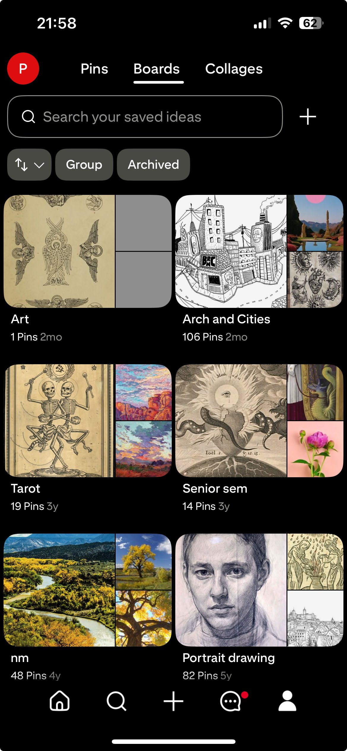
Pinterest: Personalized collections of inspiring images & artworks
Theoretical Context
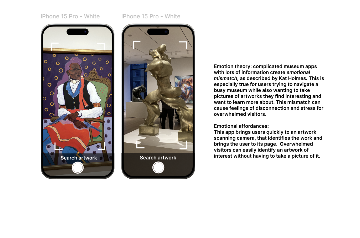
Kat Holmes, Mistmatch: How Inclusion Shapes Design: Emotional mismatch theory
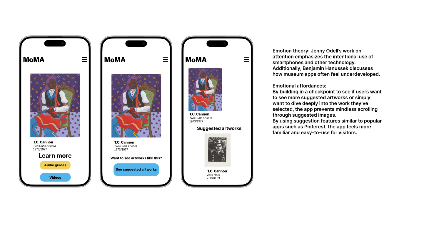
Jenny Odell, How to Do Nothing: Resisting the Attention Economy: Attention and intentional use of technology
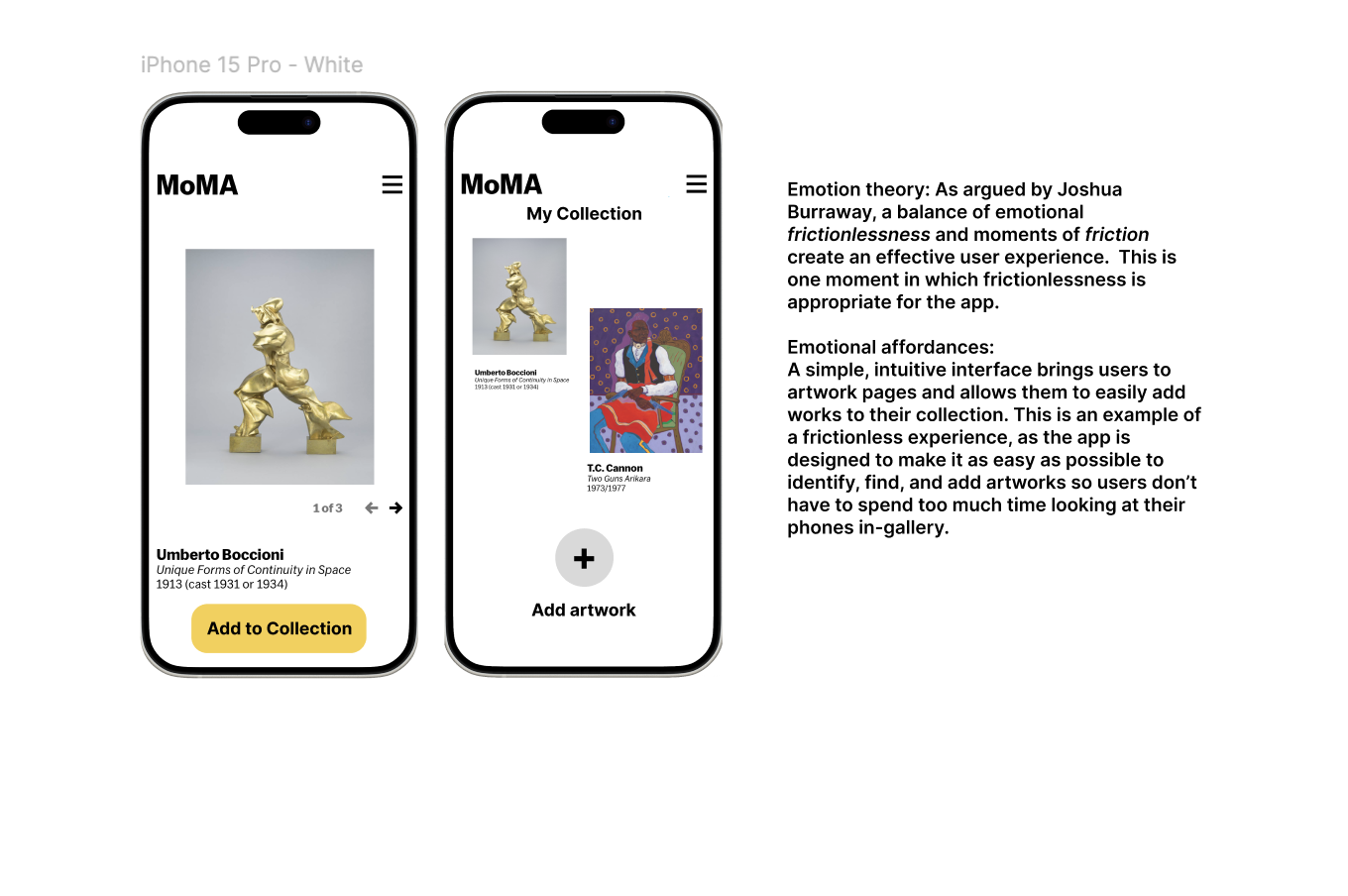
Joshua Burraway, “Fluid Friction: The Case for Friction in Public Safety Design” : Friction and frictionlessness as design affordances
Sasha Costanza-Chock, Design Justice: Community-Led Practices to Build the Worlds We Need: Methods for co-design
Benjamin Hannusek, “Enhanced Exhibitions? Discussing Museum Apps after a Decade of Development”: A survey of museum applications and their failings
Design Process
Emotional Journey Map
Concept Feedback
Initial design
Co-design session
Final design
Introduction
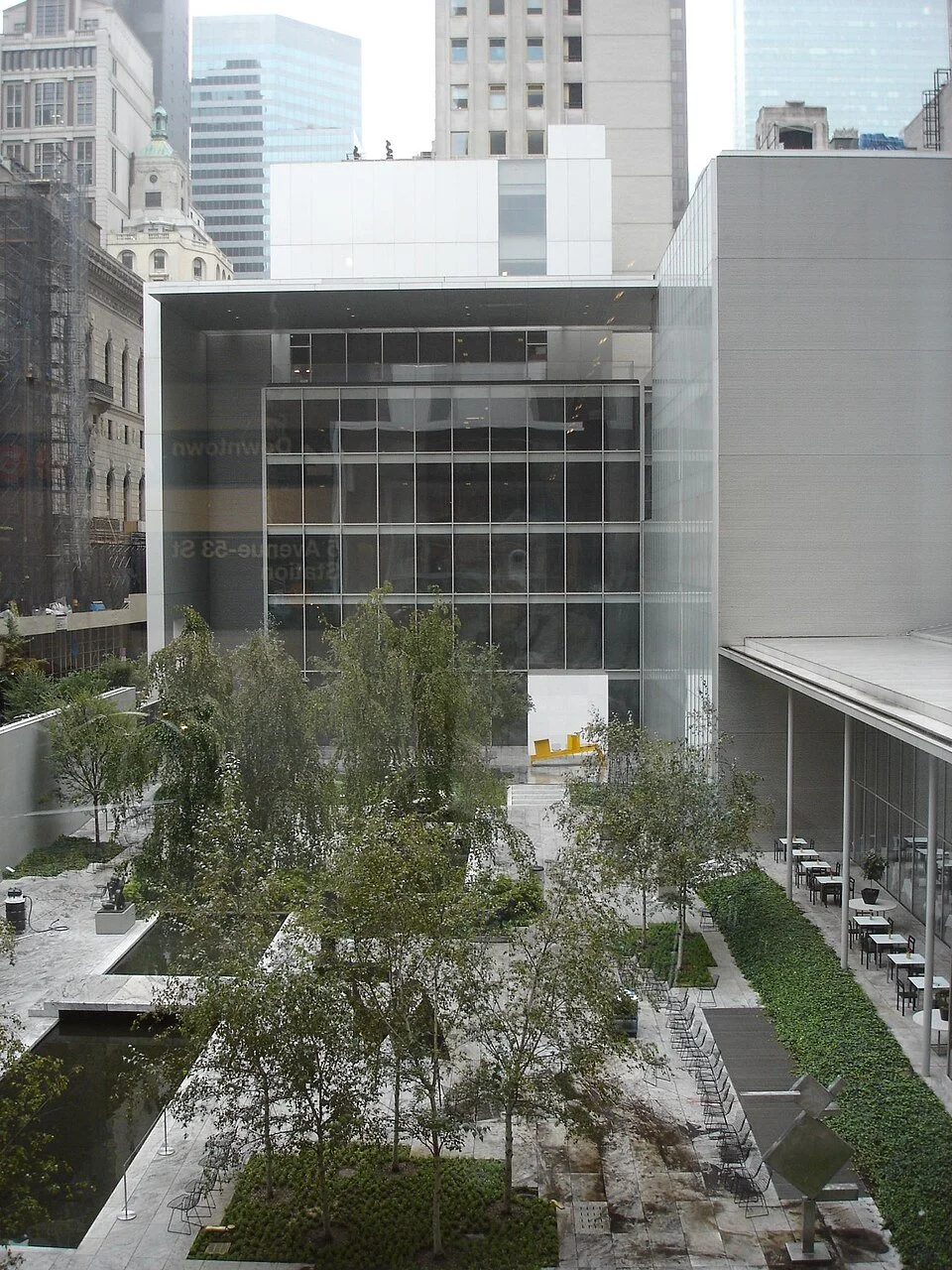
This project seeks to create a positive emotional experience for visitors to the Museum of Modern Art through a smartphone application that enhances their in-person visit.
The application will target the feelings of overwhelm, overstimulation, and anxiety that many people experience while visiting a museum, and turn these into excitement, inspiration, and enjoyment. The target institution will be the Museum of Modern Art, but the app will ideally be adaptable for museums and other historic sites worldwide.
Research questions:
How can a museum app use features and affordances that visitors have encountered on other platforms to make the user experience intuitive and fun?
How can an app make the experience of visiting a museum less overwhelming?
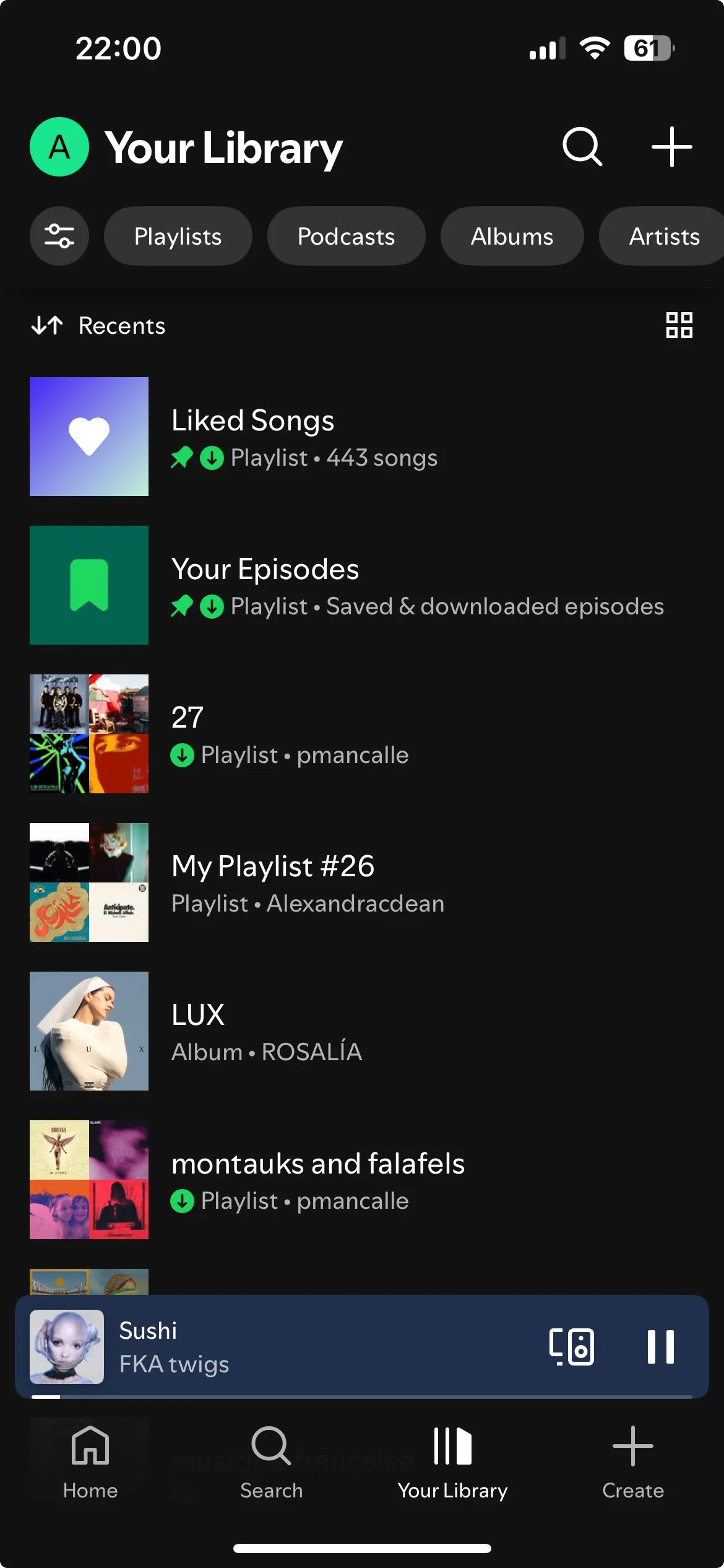
Spotify: Inuitive, easy-to-use audio player that incorporates haptics when changing songs and editing playlists
In my final design, I incorporated feedback from users, co-design suggestions, and ideas from the emotional theorists to create a streamlined app that also allows for moments of thoughtful reflextion. You can view a link to my designs on Figma here!
Bloomberg Connects: Specialized museum application with information on exhibitions and objects
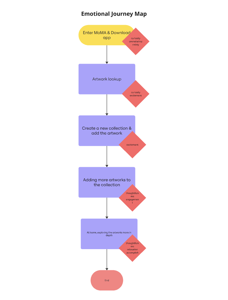
Emotional Journey Map
Narrative
Step 1: A user enters MoMA and downloads the app.
Emotions: She is feeling curious, but also a bit overwhelmed and anxious after waiting in line and entering the busy museum.
Step 2: The user finds an interesting work of art and looks it up to learn more.
Emotions: She feels curious and a bit excited about this artwork and the application.
Step 3: After reading, listening to, or watching content about the artwork, she decides that she wants to save it to her personal "collection." She creates a new collection that includes this artwork.
Emotions: The user is feeling excited about adding works to her collection.
Step 4: The user adds more artworks to her collection, creating a "mood board" of objects that impacted her.
Emotions: The user is feeling thoughtful and engaged.
Step 5: The user goes home and is able to look at her collection and learn more about the artworks.
Emotions: The user feels thoughtful and relaxed, and she also feels a sense of accomplishment at having learned so much. Finally, she feels inspired visually by the collection she created.
Concept Feedback
Yiyang’s input
Yiyang wants it to be like a checklist for a gallery show, where a user can see artworks and select the ones she is most interested in.
Another possibility she suggested was to have the artworks sequenced based on a user’s physical journey through the galleries.
She wants to see “writeups” about each work in the app.
Additionally, she would like to avoid “taking a million photos of the work and wall text” by having images of the work and wall text/more artwork info available in the app.
Alana’s input
Alana would like the app to be organized by function/action rather than content. She cites the Bloomberg Connects app as a dysfunctional system as it offers users a lot of headlines for articles or exhibition titles on the institution’s start page, rather than allowing users to find immediate actions for using the app.
A simpler user interface is better.
Emotional response:
Yiyang outlined a few elements of the museum visit experience that she finds frustrating or anxiety-inducing. Firstly, she does not enjoy having to take photos of an artwork or its wall text in order to remember details about it. She would like the app to allow her to find artworks and information about them without having to use her phone’s camera. She also likes the idea of having a map or other location-based system in order to locate artworks both in the gallery and on the app.
Alana cited the Bloomberg Connects app and other museum-specific in-gallery apps as creating feelings of overwhelm in the user, as they do not offer clear user journeys through the app. She suggested buttons that feature actions to guide the user and allow them to explore the app while in the distracting, rich environment of the museum. This would enable the user to make decisions more easily and avoid confusion or indecision.
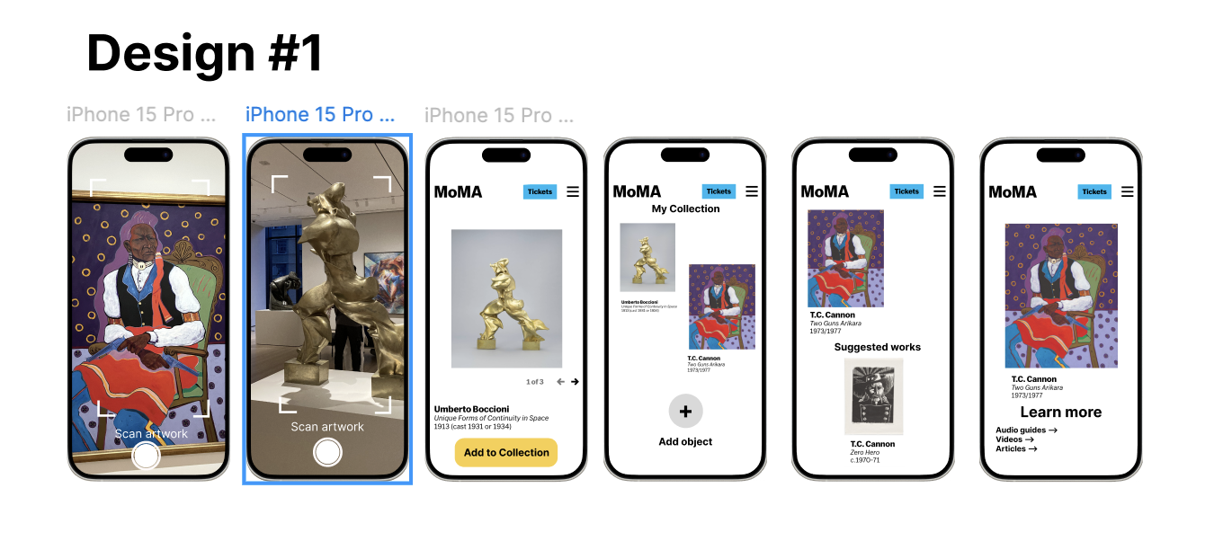
Initial Design
Co-design Session
I got design help from two friends, Yiyang and Paul. To encourage participatory design rather than just feedback, I used the co-design theory outlined in Sasha Costanza-Chock’s work on design justice. They both suggested changes that made the user interface simpler and the language clearer. Paul also suggested adding a check-in to encourage the user to reflect before diving into the suggested works section. This allows them to decide whether they would like to view more works or spend some contemplative time with the work they have already selected.

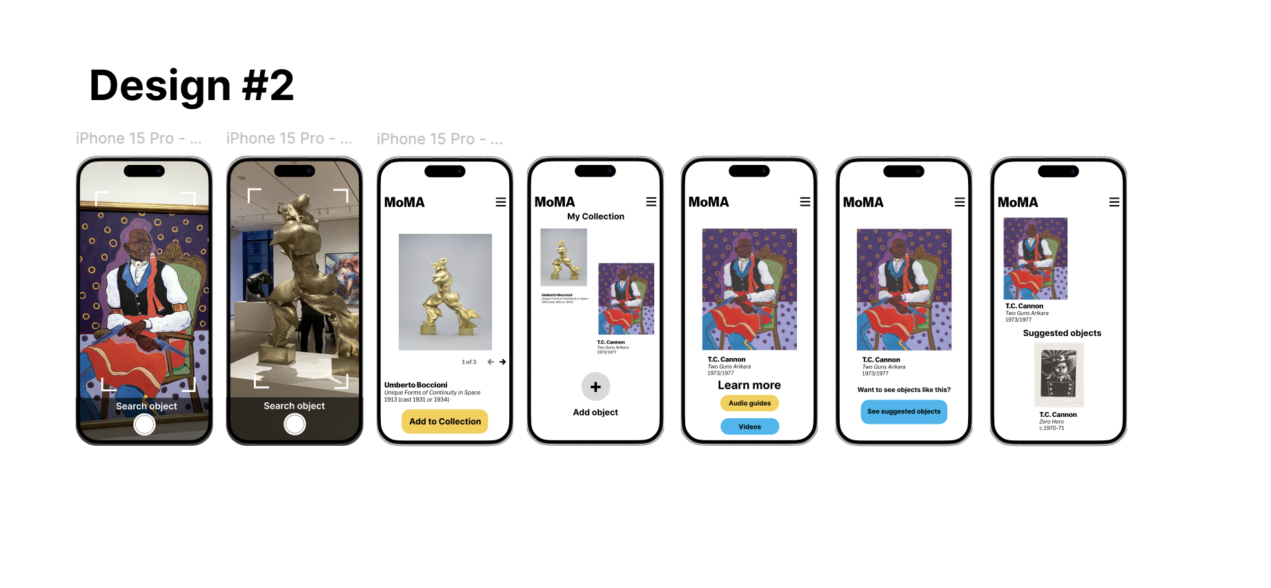
Final Design
Conclusions & Future Directions
Based on my research, I’ve found that most users want a relatively simple, frictionless interface while using the app in the galleries, but want a more contemplative, slower experience when at home learning about objects and customizing their collections.
In the future, I would like to create a usable prototype of the app and test it while at MoMA. I would like to compare it with the current MoMa website and its Bloomberg Connects pages. I would also like to explore the level of emotional connection a user feels to the museum before and after using the app through audience research. It is my hope that this app will make museum visitors feel more engaged with and excited about museums in general!